stationery-desktop-design-stuff-computer-graphic

Logo Design Trends Ruling In 2023

We’ve got the inside scoop and have closely monitored what real businesses are doing. So, listen and let us spill the tea on the major logo design trends that will slay in 2023. Trust us, these trends are more lit than a Friday night rave!

 Like any other art form, logo design is always evolving. We eagerly seek the latest trends to help designers and entrepreneurs craft a unique and eye-catching brand identity every year. Whether you’re playing with vibrant colors or sticking to a sleek, minimalist aesthetic, we all face the same age-old conundrum: what makes for a truly engaging and modern logo design?

 Despite all the expert advice, everyone still marches to the beat of their creative drum. Let’s dive in and explore the exciting world of logo design trends together!

Simplify Your Logo Design with Basic Shapes and Geometric Designs!

stationery-desktop-design-stuff-computer-graphic

2023 is all about keeping it simple when it comes to logo design. Complex logomarks are so last year and let’s be real, they can be tough to remember and connect with. That’s why more and more companies are opting for fundamental shapes like circles, squares, and triangles to create sleek and memorable logos. But just because the shapes are basic doesn’t mean the colors must be! Vibrant, high-contrast color schemes can add a pop of personality and help tell a brand’s story. Conversely, black and white designs can maximize that minimalist effect. And don’t forget about negative space – it’s an excellent way to add visual interest while keeping things clean and simple.

This “less is more” principle isn’t anything new, and big players like KIA, Google, and Citroën have already embraced the trend with their recent logo redesigns. But it’s not just about logo marks – font choices are just as important! Minimalist typography is on the rise, and it’s a perfect complement to the basic geometric shapes trend. So, in 2023, keep it simple and let those shapes and fonts do the talking!

Embrace Nostalgia with a Modern Twist In Logo Design

colorful-vector-logo-design-icon-concept

Retro styles with a modern twist take the design world by storm, appearing on fashion runways and web design trends. From the neon hues of the 80s to the grunge vibes of the 90s and the futuristic optimism of Y2K, we can’t get enough of these nostalgic aesthetics.

But here’s the thing: if you want to incorporate retro elements into your logo design, you must do it right. Make sure the style is authentic and in line with your brand messaging. And don’t be afraid to mix old and new elements to create a balanced, nuanced look. Consider pairing classic serif fonts with avant-garde logo shapes or combining muted pastels with unexpected splashes of neon.

To nail this logo trend in 2023, take inspiration from how AI remixes old designs. You’ll be amazed at how you can invent images with creativity.

Remember, knowing your target audience and communicating with them meaningfully and relevantly is important. If your logo evokes a familiar, nostalgic feeling in your customers, they’ll associate that feeling with your brand. Take a cue from nostalgic logos like Nettie, Steep, and Mellow, which strike the perfect balance between old and new.

And if you’re testing neon colors, remember that RGB is your best bet for screen use. Try using shadows and blurs to create a neon effect on paper for printed logos.

Breaking the Mold: Innovative Typography Designs And Logo Design for a Unique Brand Identity

logo-design-turbo-dynamic-alphabet-heavy-action-font

As we move into 2023, it’s clear that vintage isn’t the only logo trend on the rise. Modern typeface aesthetic is taking center stage and allowing us to witness the magic of fancy fonts in action! In 2021, we saw the emergence of experimental typography with glitchy and wavy types, and they remain all the rage.

Leading type foundries like Creative Market and My Fonts keep releasing one best-seller after another. Logo designers have finally started seeing the potential of fancily-drawn letters and incorporating them into their projects.

It all began with playful concepts, where creative minds experimented with the most outrageous types, color combinations, patterns, and graphics. Then, daring entrepreneurs in industries like cosmetics, breweries, and street food followed suit, trying out the trend. It was a groundbreaking moment when Nucao, a German chocolate brand, replaced its legible sans-serif logo with one featuring experimental typography.

Other companies, from food producers to convenience stores, are also successfully adopting this trend. It’s an exciting time for branding as more and more businesses and designers embrace bold logo trends.

Exploring the Hyperrealistic Aesthetics of the Metaverse - Logo Design

gradient-infinity-logo-design-mark-brand-identity

As we enter the era of the metaverse, it’s clear that hyperrealistic logos are becoming a crucial component of branding strategy. With the market projected to reach a whopping $800 billion by 2024, it’s no surprise that brands are eager to make their mark in this new, immersive world.

Hyperrealistic logos offer a unique opportunity to recreate the sensory experience of a brand, with haptic touch and sound adding a new dimension to traditional visual branding. As the metaverse continues to expand and evolve, it’s becoming increasingly clear that a brand’s logo must be adapted to fit this new reality.

Brands that are quick to embrace this shift and incorporate hyperrealistic logos into their branding strategy will be well-positioned to thrive in the metaverse. As the definition of the metaverse continues to expand, it’s clear that there’s immense potential for growth and innovation in this space. And hyperrealistic logos will be at the forefront of this evolution.

Embracing Muted Colors and Gradients in Logo Design

metaverse-music-logo-design-headphone

When it comes to color and choosing a palette for a logo, it’s often a very personal decision. However, if we take a closer look at big brands, there appears to be a shift from saturated to muted colors. Bright hues can be difficult to work with and draw too much attention, causing problems when implementing them into a brand’s design system. Instead, companies like Abbyy and Creative Cloud have demonstrated ultimate color proficiency, utilizing natural saturated tones on their websites, social media, and printed materials.

That being said, it’s important to note the potential for survivorship bias. While some companies have successfully utilized vibrant palettes, others have opted for more subdued hues, such as the recent rebranding of Baskin Robbins. This trend may signal to logo designers to start with soft colors and only switch to vivid tones in emergency situations.

Another exciting aspect of logo design in 2023

initial-letter-logo-design-vector-design-template

Another exciting aspect of logo design in 2023 is the resurgence of gradient logos. Once thought to be a thing of the past, gradient designs have been reimagined recently, with two-color gradients being utilized by Facebook Messenger and Avon, and gradient rainbows are seen in the rebranding of Discovery channel and Adobe’s main logo. It will be interesting to see if gradients continue to gain popularity in the coming years and if designers opt for more muted and simplistic styles.

Conclusion

The world of logo design is constantly evolving, and there is no one-size-fits-all approach to creating a successful logo. While trends may come and go, ensuring that your logo effectively communicates your brand’s message and values is most important. The key is to create a unique and memorable logo that represents your business’s strengths and distinguishes it from the competition.

Remember, Dexterous Solutions is here to help you with your logo design needs. Our skilled designers are experts in crafting creative logos that can elevate your branding to new heights. Let us help you make a significant impact in the market.

colors-and-fonts-logo-design

Logo Design – The Ultimate Guide 2023

A step-by-step guide to logo design

sun-sketch-for-logo-design

The first thing you need to do is determine what your company’s logo design should be. The most common mistake made by new businesses is creating a logo that doesn’t fit with the company’s brand identity. This can lead to confusion among potential customers about who they’re dealing with and whether or not they’ll get what they want from your business. In addition, if your business already has an established brand, your logo must fit into that branding scheme so that people know what kind of experience they will get when they visit your website or social media page.

If you’re reading this, chances are you have a business idea and want to build a brand around it. You’ve probably already decided on your company’s name and picked out some visual elements like colors or fonts. But what about your logo? Is it just an icon or symbol that represents your company? Or is it the face of your business — how people know who they’re dealing with when they come across your website or social media pages? Design choices matter — especially when creating a logo for your business- as we all know!

Importance Of A Logo Design

creative-llogo-design

A logo is the single most important element of your brand identity. It represents who you are and what you stand for, and how potential customers will identify with you. Your logo is so powerful that it can even make or break a business.

But don’t worry — there are plenty of ways to design a great logo without being an expert in graphic design or Photoshop! In this article, we’ll walk through all the steps needed to create an awesome logo, from brainstorming ideas to finalizing it on Adobe Illustrator CC (or any other vector software).

The first step in designing a logo is deciding what type of graphic you want. Do you want something simple? Or something more complex and detailed? It’s important to think about this before beginning the design process because different types of graphics will require different approaches.

Once you’ve decided on a style, it’s time to get to business with some actual design work! We’ll discuss the process below:

  1. Brainstorm a list of words describing your brand and your products or services. The list should include adjectives, verbs, and nouns (e.g., fast, reliable). You may also want to write down these words in different ways (e.g., Fast, reliable).
  2. Choose three words that best represent your brand and its values; this could be a combination of all three words or only one word if it is particularly important (e.g., fast & reliable). These will be used for the tagline on your website so choose wisely!
  3. Gathering Information and Resources.
  4. Researching the Market (Who’s out there?)

5. Creating a Design Brief (What do you need?)

How To Design A Logo For Your Company?

Can you remember a Logo Design that you did not like? I’m sure not. That’s because no one remembers bad logo design. Only good logo design sticks. That’s one of the reasons why designing a logo is different from designing other branding materials. Every aspect of your brand, be it web banners, ads, and social media posts, has its design purposes, but none are as fixated on being remembered as a logo.

CLICK TO READ MORE

The importance of a great logo can’t be overstated. Your company’s logo is the first thing people see when they visit your website or social media pages, so it needs to convey everything about who you are and what you do in an instant.

To help you create a top-notch design, we’ve put together some tips on choosing colors, fonts, and images for your logo to make it stand out from the crowd.

Logo design is an art, not a science. You can’t only rely on a step-by-step guide to getting the job done. But if you’re looking for general tips and techniques to help you along the way, this article is for you!

What You Need For A Good Logo Design

things-you-should-do-in-logo-design

You need a logo that is easy to recognize and memorable. A good logo should be simple, not cluttered with text or imagery. It should convey your company’s message clearly without being too wordy or abstract.

It’s important to consider what type of logo design works best for your business. The most common types are:

Text-based logos include words like “the” and “and.” They’re usually small but can still carry a lot of meaning if used correctly. They tend to work well for small businesses that want something simple but still personal or have particular words associated with their brand (e.g., “The Best”).

A good logo design is about more than just the image. It’s also about what that image stands for and how it represents your brand.

Below are some of the key things to consider when designing a logo:

What Colors You Should Use?

The colors used in your logo should reflect the personality of your company or brand and its industry. This means that if you’re selling high-tech electronics, blue would be an appropriate color choice, but red might be a better choice if you’re selling gardening supplies. The same rule applies to fonts — choose one that fits with the theme of your business and use it consistently throughout all marketing materials (including social media posts). Size matters! Smaller logos look more modern and sleek than larger ones, so make sure yours isn’t too big or too small (at least not without reason). Don’t overuse icons — they’re great for representing specific products or events within your line of business, but don’t expect them to represent everything else (especially scratch-offs!).

Types Of Logo Design

There are two main types of logo design. One is where you’re creating an entirely new brand like Nike and Apple did when they were first starting. The other type is when you’re adding a logo to an existing business or organization that already has a name in it.

The process for both types of design is similar, but some differences are worth noting. In this article, we’ll discuss starting a new brand from scratch, then move on to the more common question of adding your logo to an existing company’s branding materials (we’ll use Amazon as an example).

Make An Impression On Your Audience

Designing a logo is similar to writing an article or blog post: you have a lot of information, but it’s not easy for the reader to understand what’s important. You also have only a few words (or images) to make an impression on your audience. The trick is finding the right balance between detail and brevity so that readers can get what they need from your content without being bored by too much extraneous information.

Conclusion

A logo is a mark or symbol that represents your company’s brand identity. It can be used as an identifier on business cards, letterhead, packaging, and other promotional materials. The purpose of a logo is to help people identify with your business and its products or services. A good logo will represent all aspects of your brand — including the emotional connection between customers and products.

Dexterous Solutions is a global branding and Digital marketing and Design agency based in the US, serving companies of all sizes. We specialize in understanding your brand and vision and work closely with you to craft branding and marketing assets that align with your brand strategy, mission, vision and goals. With satisfied clients worldwide, let’s connect and explore how we can help you achieve your business goals.

 
dexterous-banner

What is Dexterous Solutions?

Disruptive, out-of-the box, trailblazing and unconventional are all words used to describe Dexterous Solutions. But the question remains, what is Dexterous Solutions and who are the people behind it?

branding-strategy-business

What is Dexterous Solutions?

Dexterous Solutions is a team of professionals who are the answer to all your digital marketing, designing and web development needs. Be it corporate branding, social media revamping or developing an e-commerce website, we’ve got it covered!

So how was Dexterous Solutions formed? A group of friends at lunch, discussing problems they face in business. What was the common problem amongst all? Creating and marketing their brand with consistency, creativity and affordability, all while achieving growth and projects being delivered on time. One of the bunch decided to start his own company to cater to these problems being faced in the market, with his first clients being those same friends he had gone to lunch with.

ideas-strategies-for-brand-design

WHAT DO WE DO?

Dexterous Solutions became a company that specializes in corporate branding, which includes, but is not limited to establishing a brand’s voice, and its perception in the minds of its customers. We also work on logo designstationery designsocial media design and web design.

branding-and-stationery-design

More Expertise

Our next area of expertise lies in digital marketing, this includes search engine marketing, social media marketing and search engine optimization. We work on pay-per-click (PPC) ads, google ads, Facebook ads and other social media platform ads, with the aim to help our clients rank better on search engine result pages. Why do brands need to rank better on search engine result pages you ask? Well, the answer to that is more visibility to prospective customers. The higher a brand ranks, the more likely potential customers are to click on its website or social media pages, eventually bringing in more traffic.

 
RESPONSIVE-WEB-DESIGN-CODE-AND-EXECUTIONS

Content Creation

We work on creating content that converts. Our team focuses on creating textual content that is engaging, search engine optimized, informative, catchy and easily comprehendible, as well as infographics and motion graphics that are aesthetically pleasing and detail-oriented. Starting a new business, and need a website, but don’t know where to start? Well, that’s where Dexterous Solutions comes in. We provide web design and development services that create smooth user experiences with minimized costs, great functionality and excellent features. We create the user interface and user experience (UI/UX) designs and execute them by developing websites on platforms like WordPress, Magento and Shopify.

a-man-designing-ui-ux-manually

Dexterous is a one-stop shop to all your digital needs, what makes us stand out? Our minimized costs, efficiency, timely delivery and most importantly, our creativity!

logo-designing-illustration

Logo Design – Principles, Types, And Ideas

Can you remember a Logo Design that you did not like? I’m sure not. That’s because no one remembers bad logo design. Only good logo design sticks. That’s one of the reasons why designing a logo is different from designing other branding materials. Every aspect of your brand, be it web banners, ads, and social media posts, has its design purposes, but none are as fixated on being remembered as a logo.

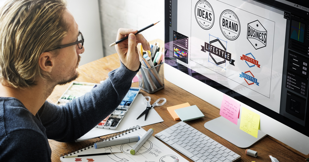
a-man-designing-a-logo

Though a Logo Design may seem fairly simple to create, designing an impressive one isn’t always easy. It includes a great deal of market research, a profound understanding of your buyer personas, and thoughtful contemplation of the values of Logo Design. Often, designers find themselves fashioning many iterations of a single logo before getting it “spot on.”

A Logo Design can be simply defined as your company’s identification. It’s how your company is recognized among the businesses. A Logo Design functions as the face of your company. Because of this, logos can be a great opportunity to make a statement about your brand. Take Amazon, for example. The smiley arrow indicates that the company sells everything from “A-Z” and also signifies how pleased customers are when they shop with them.

Even though a Logo Design can communicate a deep meaning, it’s not vital that it has to. If your designers are struggling to decide on such a logo, you’re asking too much of them. So, how do you begin designing a logo? I have broken down some key steps you’ll need to take to curate a logo that not only you, but your prospects will love.

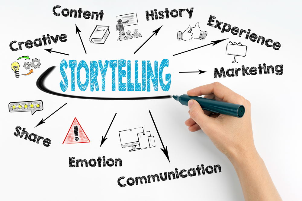
Create your brand story

brand-story-telling

Before even thinking about what your company logo will look like, take some time to ponder the story behind your company. When we look at Coca-Cola, we don’t see a brown, carbonated beverage — we see polar bears and thick, white script letters.

To connect with your clients, you need to communicate the “why” behind your brand. It is the root of your story and it needs to be visible through your Logo Design.

product-design-and-shoot

Find design inspiration

Getting started is mostly the toughest part of any creative endeavor. It usually happens that you have too many ideas at once and you suffer from analysis paralysis. This means you get stuck in analyzing and cannot make a decision. To avoid this situation, think about your favorite Logo Designs. And what made them so memorable.  You can take help from Logo Design-related hashtags on social media. Instagram specifically is good for this because of its visual nature. Whenever browsing next make sure to check out popular hashtags like

#logo

#logodesigns

#logodesigner

#graphicdesign

#graphicdesigner

Choose your logo design style

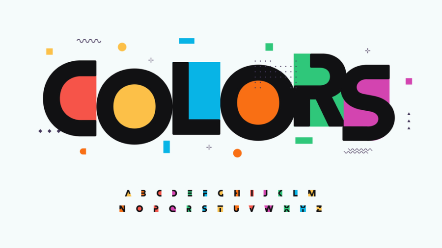
Now that you clearly understand your brand and feel inspired, it’s time to start interpreting that into your Logo Design. There are numerous elements that you need to work on here, like colors, shapes, graphics, and typography. When thinking about your logo design, it is vital that you pick the correct design aesthetic. You can choose from a wide variety of designs like classic, trendy, minimalistic, quirky, or just mix and match.

Choose colors that reflect your brand

The colors that you choose to represent your Logo Design will end up on your website, signages, social media, marketing emails, and everywhere a user interacts with your brand. You need to make sure you are conveying the right message through your logo design colors

Choose your logotype

It is better to do some research on logotypes before finalizing your Logo Design.

Monogram logo designs are made of letters, mostly brand initials. They are simple and help people remember the company behind the Logo Design. For example, IBM (international business machines).

A wordmark logo is a font-based logo design that represents the company name. for example, Visa, Jeep, etc.

Pictorial mark logos are graphic based. Seeing one immediately helps you recognize the company. Think Instagram, apple, etc.

Similarly, there are abstracts, mascots, and combination marks in the types you can consider while finalizing a logo design.

Choose the right typography

You should pick a font that balances and completes your Logo Design. There are 4 elementary types of fonts you can work with to give your Logo Design an exclusive look.

Serif fonts

Serif fonts give your Logo Design a classic and posh look. The distinguishing feature of this font is the little feet at the end of the letters, which make them appear classic and vintage.

Sans serif fonts

These are great if you want to give your logo a modern and clean look. They are simple and sleek, which makes them perfect for modern brands.

Script fonts

If you want to opt for an individualistic look, script fonts are the right choice for your logo. There is a huge variety ranging from handwritten to calligraphic and relaxed scripts.

Display fonts

Display fonts are ornamental and eye-catching.

If you combine different fonts in your logo design, it can have a very powerful effect. The right approach would be to pair all the design elements that you have now and create the vibe that you’re looking for.

Trust your designer and make sure to communicate well. Stay open to suggestions and give lots of feedback. If you and your designer work together, you will come up with the best logo design.


Dexterous Solutions is a global branding and marketing agency based in the US, serving companies of all sizes. We specialize in understanding your brand and vision and work closely with you to craft branding and marketing assets that align with your brand strategy, mission, vision and goals. With satisfied clients worldwide, let’s connect and explore how we can help you achieve your business goals.