
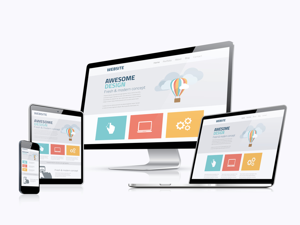
Responsive website design, commonly known as RWD, is a design strategy to automatically alter the website according to the screen size. This makes sure that the feel of the website remains seamless and uniform, irrespective of the device being used by the user. For example, a laptop, tablet, and mobile will use one HTML code on the same URL. The concept of responsive website design is becoming an integral part of the life of developers worldwide. The responsive website design was first introduced in 2010 and has been recommended since then.
IMPORTANCE OF RESPONSIVE WEBSITE DESIGN
The main purpose of a responsive website design is to make the visitor experience as best as possible. The goal is to eliminate unnecessary scrolling, resizing, and zooming on the website. This ultimately leads to a consistent user experience resulting in increased lead generation, sales, and conversions. The analytics are easily trackable and the reach increases profoundly. Research shows that Mobile web traffic has surpassed desktop traffic and now accounts for more than 55 % of overall website traffic. As a business owner, it is vital to impress the user in the first 3 to 4 seconds, and a responsive website design helps in making that possible.
The domination of mobile users on the internet started in 2015. Google started perceiving that trend and released Mobilegeddon, an update to their search engine algorithm which involved a website’s mobile-friendliness as one of the ranking factors. This update was designed to boost mobile-friendly and responsive websites in the SERP. The importance of ranking high in search engines is not a new concept. Hence, web pages that are mobile-friendly and follow the best practices of high readability and a friendly user interface have a better chance of ranking higher in search engines. Especially Google.
A responsive website design can make it very easy and quick to make changes. Designers don’t have to make updates on two different sites separately. Having two separate versions of a website result in duplication of content which ultimately lowers the search engine ranking. Having one responsive website design saves developers a lot of time and energy. Which makes this idea quite cost-effective.
BENEFITS OF A RESPONSIVE WEBSITE DESIGN
IMPROVED USER EXPERIENCE
Visitors to your website will have a great experience if it is responsive, no matter which device is being used. It is highly likely that they spend more time on your website if they face no issues in scalability and effective response while navigating. A responsive website design gives business owners peace of mind that their users can access all the content they want without any hassle or getting frustrated.
HIGHER CONVERSION RATES
According to research, the average Smartphone conversion rate is 64 percent greater than the average desktop conversion rate. It is evident why designing a responsive website with an improved user experience is the key to increasing conversion rates. Your visitors will develop trust in your business as they spend more time on your website, which will result in higher conversion rates.

CONSISTENT BRANDING ACROSS DEVICES
Users access websites with varying devices. Business owners must provide a streamlined experience and feel across any device being used. A responsive website design allows consistency in visuals and call to action.
SOCIAL MEDIA SHARING
A responsive website design improves how your content is shared across social media platforms. If your website has a responsive share button, it is easy for users to share embedded links on small screens even. This results in increased traffic and the introduction of your brand to a new audience. Increased traffic and engagement will help your search engine ranking as well.
WEBSITE MANAGEMENT
Businesses, especially smaller ones, don’t have a lot of time to work on the look of their website. A responsive design accounts for making changes quickly and easily. In this way, concentrating on other aspects of the business is easier.
COST-EFFECTIVENESS
Maintaining websites for mobile and non-mobile users can get expensive. By designing responsive websites and plans, money can be saved because you won’t be paying for a mobile site separately. Support costs will be lower when running one instead of two variants of a website.
INCREASED INTERNET SHOPPING
Another benefit of having a responsive website design is making the user’s shopping experience easy. Internet shopping is very straightforward and gaining popularity every passing day. 80% of customers consistently use their mobile phones for shopping online. If your website is not mobile-friendly, you are losing a great number of customers.
CONCLUSION
Presently, a large number of people are accessing the internet using mobile phones instead of laptops or desktops. So, your website needs to have great visuals and be responsive on mobiles as much as on laptops and desktops.

