Secret to a high-converting website
Are you getting views on your website but need more sales? You should start working on your Web Design.
You can change your situation by converting those window shoppers into buyers. All you need to do is Work on your Web Design and use conversion optimization. But how will you do that? Think about these points first:
- Visitors have a limited attention span, most leaving within 8 seconds of arriving on a website.
- The majority of website visitors are still waiting to make a purchase.
- Having multiple landing pages can increase the number of leads.
- Adding product videos can significantly boost sales by 144%.
- Even a slight delay in site speed can negatively impact conversions by 7%.
- A/B testing is a popular and effective method for optimizing conversion rates.
A well-designed website is crucial for the success of businesses. A poorly designed website can hinder conversions and drive visitors away even if a business has a strong marketing team, good SEO, and a great product.
Our web design services focus on creating high-converting websites that are easy to navigate, free of interruptions, clearly branded, and focus on the selling point.
We understand that the ultimate goal of a business website is to increase conversions and improve search engine ranking.
It’s important to remember that while creativity is essential, it should not come at the expense of conversions. By using the following web design strategies as a guide to auditing your business website, you can improve conversions and boost your search engine ranking in Google.
- High Converting
- Easy to Navigate
- Interruption Free
- Branded
- Focused on the selling point
Strategies
A well-designed website is vital for business success. Focusing on the strategies below ensures your website is driving conversions and improving your search engine ranking.
Aim for a clear value proposition
A clear and unique value proposition is critical for businesses to stand out in a competitive online market. Your value proposition should effectively communicate the benefits and advantages of your product or service over your competitors.
It’s vital to ensure that your value proposition is prominently displayed within your overall web design. Many web designers need to correct the mistake of placing it in hard-to-find locations on the website.
If potential clients or customers can quickly and easily identify what sets you apart from the competition, they will likely stay on your website, and your conversion rates will improve. For this reason, it’s essential to prominently display your unique value proposition in a central location within your web design to improve conversion rates and boost your business online.
Example
“Just Do It” – Nike.
Nike’s “Just Do It” slogan is an excellent example of a unique selling proposition. It communicates the brand’s focus on empowering and motivating people to be active and reach their full potential. It also aligns with the brand’s image of being energetic and confident and providing the gear and inspiration necessary to achieve your goals.
The slogan is simple yet powerful and has become synonymous with the brand, helping it to stand out in a competitive market.
When creating a website, it’s important to ensure that the design aligns with the industry and complements the value proposition. The web design style should be tailored to the specific nature of the business. For example, a website for a luxury fashion brand should have a high-end and luxurious design. In contrast, a website for a construction company should have a more rugged and professional design.
By ensuring that the web design is consistent with the value proposition and industry, it will be more effective in communicating the business’s unique selling points and converting visitors into customers.
Test your CTA - Call To Action
A recent study by HubSpot found that personalized CTAs convert at a rate of over 202% better than essential, multivariate, and smart CTAs. To effectively convert leads and increase your overall conversion rate, it’s important to meet users where they are in the funnel and tailor your CTAs to their specific needs.
For example, if you offer home security services, you could set up CTAs like this:
Visitor CTA: Learn About the Top 5 Home Security Trends
Lead CTA: Schedule a Free Security Consultation
As a historical example, when Amazon increased sales of their Kindle e-readers, they used a clear and direct call-to-action, “Buy Now”, which was more effective than a less specific one like “Explore Kindle Devices”. This made the psychology of CTAs clear that Kindle devices were available to buy and drew the reader to purchase the product.
Make navigation easy
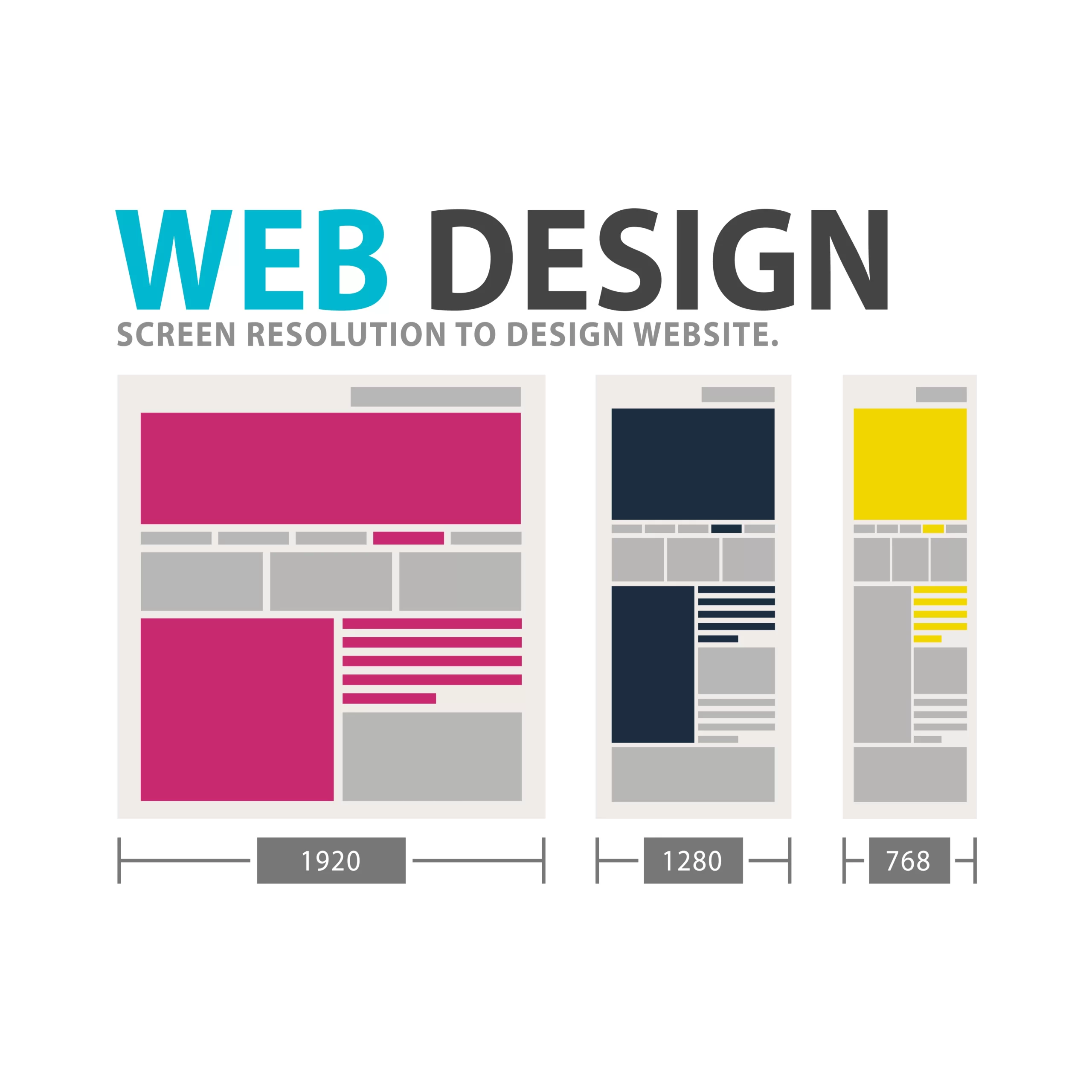
A successful web design should guide visitors towards the desired action, whether making a phone call, filling out a contact form, or sharing content on social media. Additionally, research shows that including a chat button can significantly increase conversions, sometimes by as much as 30%.
It’s vital to ensure that your site navigation is designed to support these intentions. By making it easy for users to navigate the site with minimal clicks, you increase their chances of taking the desired action and ultimately boost your conversion rate.
Simplicity is key when it comes to web design, especially when it comes to navigation. Keep labels and headings easy to understand and avoid anything considered cryptic or challenging for visitors. This is especially important for mobile and tablet web design, where you aim to enable users to reach their desired information, product, or service with just one click.
To ensure that your navigation is straightforward and effective, take the time to review it and ensure it’s simple and accurate. Additionally, remember the principle of Hicks Law, which states that the more choices you offer, the longer the reaction time, and the more likely users are to become indecisive. Keep it simple and watch your conversions soar!
Consistent Branding
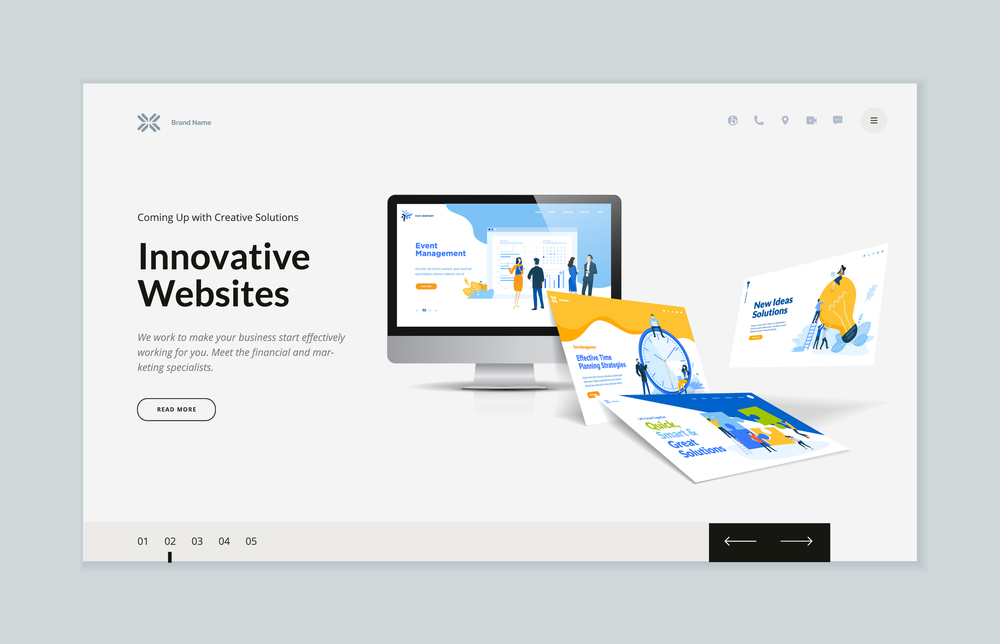
A consistent brand image is key to creating a seamless user experience and driving conversions on your website. This means ensuring that your logos, colors, fonts, and imagery are consistent across all site pages.
According to Web Hosting Secrets Revealed, visitors judge your website in just 50 milliseconds. That’s why it’s crucial to pay attention to the visual elements of your web design, like images, layout, and titles, to make a solid first impression.
To ensure consistent branding, use the same color scheme, font style and imagery throughout your website. Additionally, ensure that critical elements like contact forms and calls to action are placed in similar locations on each page. This will help to minimize confusion and make it easier for visitors to find what they’re looking for.
Business web design is not only about creating an attractive website but also about creating a website that converts. Businesses can improve their conversion rates and boost their search engine ranking by focusing on strategies such as a clear value proposition, tailored CTAs, easy navigation, and consistent branding. However, it can be challenging to implement these strategies effectively without the help of a professional web design team. That’s where Dexterous Solutions comes in. Our team of experts can help small businesses create high-converting websites that are easy to navigate, free of interruptions, clearly branded, and focused on the selling point. Contact us today to learn more about how we can help your small business succeed online.

